Cabinet Coppens
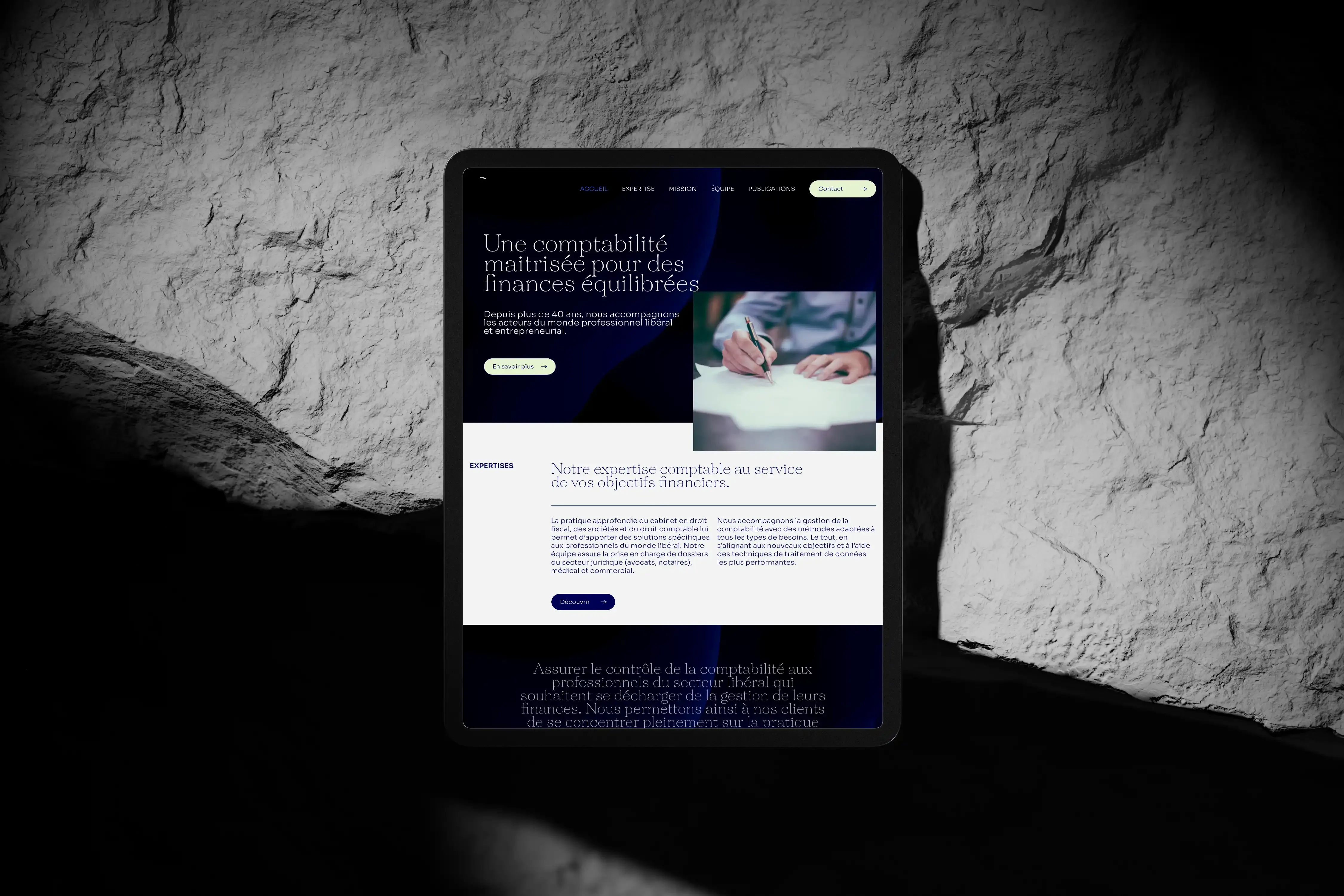
Website for Cabinet Coppens, a firm of chartered accountants and tax advisers, designed to provide information about services and facilitate client engagement.
Website Wordpress ElementorCSS
Context & Goals
Cabinet Coppens, an accounting firm, was my first project during my internship at Fauves Agency — my very first hands-on experience with WordPress. I came into it straight from BeCode, where my training had been entirely code-first (HTML, CSS, JavaScript, React), with no exposure to CMS platforms. This project was my introduction to a completely different way of building for the web.
The goal was to integrate a design provided by Morgane, Fauves Agency's art director, with pixel-perfect precision into WordPress/Elementor — while learning the CMS from scratch in a live production environment.
Role: Front-End Integrator (WordPress/Elementor)
Stack: WordPress, Elementor, CSS
Constraint: Real client deadline, zero prior WordPress experience.
Problem & Design Challenges
The core challenge wasn't technical complexity — it was a shift in mindset. I had to:
- Learn WordPress and Elementor from scratch, in a live production environment, on a real client deadline.
- Integrate a design with pixel-perfect precision — matching typography, spacing, and visual details exactly as designed, not approximately.
- Understand where Elementor's native capabilities stopped, and recognize when a requirement needed custom code instead of forcing a workaround.
The deeper problem: coming from a pure-code background, my first instinct was to question why a CMS was the right choice at all. I had to set that bias aside and learn the tool on its own terms.
Concept & UX Approach
I approached this project with two priorities:
Respect the design intent — Every spacing value, every font weight, every alignment detail was checked against Morgane's file — not "close enough," but exact. The discipline of pixel-perfect implementation became the foundation for how I evaluate tool output today.
Learn when to trust the tool and when to override it — I started by exploring Elementor's building blocks: sections, widgets, global styles, and how they mapped onto the design file. I learned to see CMS constraints not as limitations, but as clear boundaries between what the tool handles well and where custom code earns its place.
Beyond the interface, I also learned to look past pixels: the copy, the user flow, and the story the site was trying to tell about Cabinet Coppens mattered just as much as how faithfully I implemented the design.
Architecture & Implementation
Elementor Exploration
I started by mapping Elementor's building blocks against Morgane's design: sections, widgets, global styles, and how they translated into the layout. Coming from pure code, this was a different mental model — building visually with pre-made components instead of writing markup.
Pixel-Perfect Integration
Every component was checked against the design file for exact spacing, font weights, and alignment. The clearest example: a card component in a repeating grid was resizing unpredictably in Elementor, breaking visual consistency with the other cards. Elementor's native sizing options couldn't produce a stable, uniform result, so I stepped outside the tool and wrote custom CSS to force consistent dimensions across the whole card set.
Custom Code for Tool Limitations
This card fix was the first time I really understood when to trust the tool and when to override it — a pattern that now informs every CMS integration I do.
Development Workflow
My workflow was a loop between two modes:
Design reading: studying Morgane's file to understand not just what was on screen, but why — the intent behind each decision.
Implementation: translating that intent into Elementor components, testing each one against the design, adjusting spacing and styling iteratively.
Custom code escape: when Elementor couldn't match the design, writing targeted CSS to fix specific inconsistencies without fighting the tool's architecture.
The typical daily rhythm: build a section in Elementor, compare it to the design file, adjust pixel by pixel, move to the next section. The card-sizing bug broke that rhythm — it forced me to step outside Elementor entirely and solve it with code, which became the most instructive moment of the project.
Key Decisions & Trade-offs
WordPress/Elementor over custom code: for a client who needs to manage content independently, WordPress was the right choice — even if it meant learning a new tool from scratch under deadline pressure.
Pixel-perfect over "close enough": I could have shipped approximate matches and saved time. Instead, I held every detail to the design file. The discipline matters because small visual drift compounds fast across a multi-page site.
Custom CSS instead of fighting Elementor: when the card-sizing issue appeared, I could have tried workarounds within Elementor's widget settings. Instead, I wrote a targeted CSS fix — faster, cleaner, and more reliable than fighting the tool's constraints.
Bias aside: I came in skeptical of CMS platforms. I left understanding that the more tools you genuinely understand, the better equipped you are to choose the right one for a given problem, rather than defaulting to what you already know.
Challenges & What I Learned
Challenge: Learning WordPress under real deadline pressure
This wasn't a sandbox project — a client was waiting. I had to learn Elementor's interface, widget system, and responsive behavior fast enough to produce production-quality work. It taught me that tool proficiency matters less than understanding the problem: once you know what "pixel-perfect" means, the tool is just the means to get there.
Challenge: Respecting a designer's intent, not just matching pixels
Every spacing value and font weight had a reason behind it. I learned to read design decisions as intentional choices, not arbitrary numbers — a discipline that now shapes how I implement any designer's work.
Challenge: Recognizing when a tool has reached its limits
The card-sizing bug was a turning point. Instead of forcing Elementor to do something it couldn't, I stepped outside with custom CSS. It taught me that knowing when to override a tool is as important as knowing how to use it.
Result: A fully integrated WordPress/Elementor website matching the art director's design with pixel-level accuracy, and my first practical fluency in a CMS environment — built on top of, not instead of, my code-first foundation.
Current Status & Next Steps
The site was delivered and the client manages content independently through WordPress. This was my first internship project, and it remains the reference point for how I approach CMS integrations.
If I were to revisit this project today, I would:
- Propose a component library in Elementor to prevent future visual drift across pages.
- Set up performance monitoring (images, scripts, caching) from the start, not as an afterthought.
- Push for a headless CMS approach if the client's needs had justified it — decoupling content from presentation for greater flexibility.
Why This Project Matters
For recruiters and hiring managers, this project shows I can transition from code-first training to a CMS environment without losing quality. It demonstrates pixel-level attention to detail, respect for a designer's intent, and the judgment to know when a tool's limits require custom code rather than workarounds. It's a small project, but it taught me the discipline that now underpins every integration I do.
For developers and tech leads, it shows I don't dismiss tools I haven't used — I learn them, understand their constraints, and make pragmatic choices based on what the project actually needs. The card-sizing fix is a small example, but it captures the pattern: observe the problem, understand the tool's limits, solve precisely, move on.