DevFlow — Developer-First Collaboration Tool (UI/UX Concept)
Collaborative tool designed to enhance team efficiency, featuring real-time updates and intuitive task management.
Web app Desgin Exploration UI/UXFigmaMicro-interactions
Context & Goals
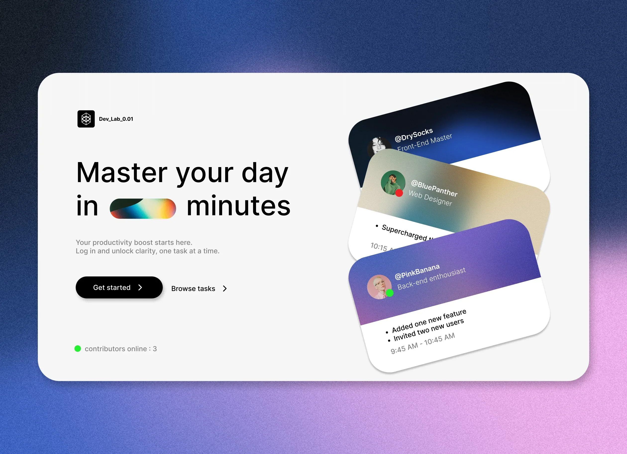
Most collaborative task tools are designed for general audiences, not for how developers actually organize their work. DevFlow started as a design exploration: what would a task/collaboration tool look like if it were built from the ground up with developers as the primary user — closer to their existing tools and mental models, rather than generic boards and cards.
This project focused on the homepage and core interface as the anchor for the whole visual direction. It's a design concept and UI direction, not a finished product — it captures the visual and interaction language I'd want a developer-first collaboration tool to have, built with React on the front-end.
Role: UI/UX Designer & Front-End Developer
Stack: React, Figma (design)
Problem & Design Challenges
The problem was conceptual rather than technical: existing tools like Trello or Asana are built for general-purpose project management, but developers think and organize work differently. They work in code editors, terminals, dashboards — environments optimized for density, speed, and precision. The challenge was to design an interface that speaks that visual language without sacrificing approachability.
From that question, three constraints emerged:
- The UI needed to feel like a developer's natural environment, not a generic productivity app with a dark theme.
- Information density had to be higher than typical task tools — developers scan fast and expect detail at a glance.
- The visual identity had to be distinct from mainstream tools, giving the concept its own point of view rather than blending in.
Concept & UX Approach
I defined three design pillars:
Clean, technical aesthetic — a visual language that feels closer to a developer's existing tools (code editors, terminals, dashboards) than a generic productivity app, while staying approachable and modern.
Clarity over decoration — strong typography and hierarchy to keep the interface legible and fast to scan, prioritizing information density in a way general-audience tools tend to avoid.
A distinct identity — deliberately avoiding the visual conventions of mainstream tools like Trello or Asana, to give the concept its own point of view rather than blending in.
The goal wasn't to build a better Trello — it was to ask what a task tool would look like if it were designed by developers, for developers, from the first pixel.
Architecture & Implementation
This was primarily a design and UI project, not a full-stack application. The implementation focused on:
Front-End in React — I built the homepage and core interface components in React, using the design system I defined in Figma. The component architecture was structured to be extensible — each UI element (task cards, navigation, sidebars) was built as a reusable unit, even though this was a concept project.
Design System in Figma — I defined a complete visual system: color tokens, typography scale, spacing rules, component states. This made it possible to prototype new screens quickly while maintaining consistency across the whole concept.
Interaction design — I focused on the micro-interactions that make a developer tool feel responsive: hover states, transitions, focus indicators. The details that separate a mockup from something that feels like it could ship.
Development Workflow
The project followed a two-track workflow:
Design first: I explored layouts, typography, and component structures in Figma before writing any code. This let me iterate on visual decisions quickly without the overhead of code changes.
Implement in React: once a direction felt right in Figma, I translated it into React components. The gap between design and code was minimal because the design system was well-defined — most decisions were already made before implementation started.
Iterate in code: some interaction details (hover states, transitions, spacing tweaks) only revealed themselves once the components were live in the browser. I refined these directly in code, then updated the Figma file to match.
Key Decisions & Trade-offs
Concept over completeness: I chose to build a polished homepage and core interface rather than a shallow multi-page prototype. Depth in a few screens communicates intent better than breadth across many.
Design system before code: defining the visual system in Figma first saved implementation time and prevented the "design drift" that happens when visual decisions are made ad hoc in code.
React as the implementation medium: even though this was a design exercise, I chose React to keep the implementation grounded in real-world constraints — component boundaries, state, and rendering behavior all inform design decisions.
No backend, no data layer: I deliberately kept this as a front-end concept. The value was in the visual and interaction design, not in building a functional task management system.
Challenges & What I Learned
Challenge: Designing for a specific audience, not a general one
Most task tools optimize for breadth — they need to work for marketers, designers, project managers, everyone. DevFlow was an exercise in the opposite direction: designing for a narrow audience with strong existing preferences. It taught me that constraints from the user, not just the business, can produce sharper design decisions.
Challenge: Balancing "developer aesthetic" with approachability
Developers like dense, fast interfaces — but density can easily become clutter. Finding the line between "feels like a terminal" and "actually usable for daily task management" was the hardest design problem in the project.
Challenge: Knowing when a concept is "done"
Without a product brief, scope creep was a real risk. I learned to set my own boundaries: a polished homepage, a clear visual system, and enough interaction detail to communicate the concept. Everything else was explicit scope.
Result: A design concept that demonstrates how interfaces can be shaped around specific user mental models, not generic templates — and a React implementation that shows I can translate design intent into real code.
Current Status & Next Steps
DevFlow exists as a design concept with a React homepage implementation. It's not a shipped product, but it captures the visual and interaction direction clearly enough to evaluate.
If I were to evolve this project, I would:
- Build out a task board view with drag-and-drop to test the concept in a more interaction-heavy context.
- Add keyboard-driven navigation — a non-negotiable for developer-facing tools.
- Explore how the visual system adapts to different themes (dark, light, high-contrast) while maintaining the same density and hierarchy.
- Document the design system as a standalone deliverable — it's reusable beyond this specific project.
Why This Project Matters
For recruiters and hiring managers, DevFlow shows I can think beyond "build a pretty page" — I can identify a specific audience, define a visual language that speaks to them, and execute it in code. It demonstrates design systems thinking, UI craft, and the ability to set my own project constraints and ship within them.
For developers and tech leads, it shows familiarity with React and component-based architecture, but more importantly, it shows I care about the "why" behind design decisions — not just what looks good, but what serves the people using it. The project is small, but the thinking behind it is the same thinking that shows up in larger, more complex work.