Martine Henderyckx
Website for Martine Henderyckx, a wellness platform, designed to provide information about services and facilitate client engagement.
Website UIWordpress ElementorCSS
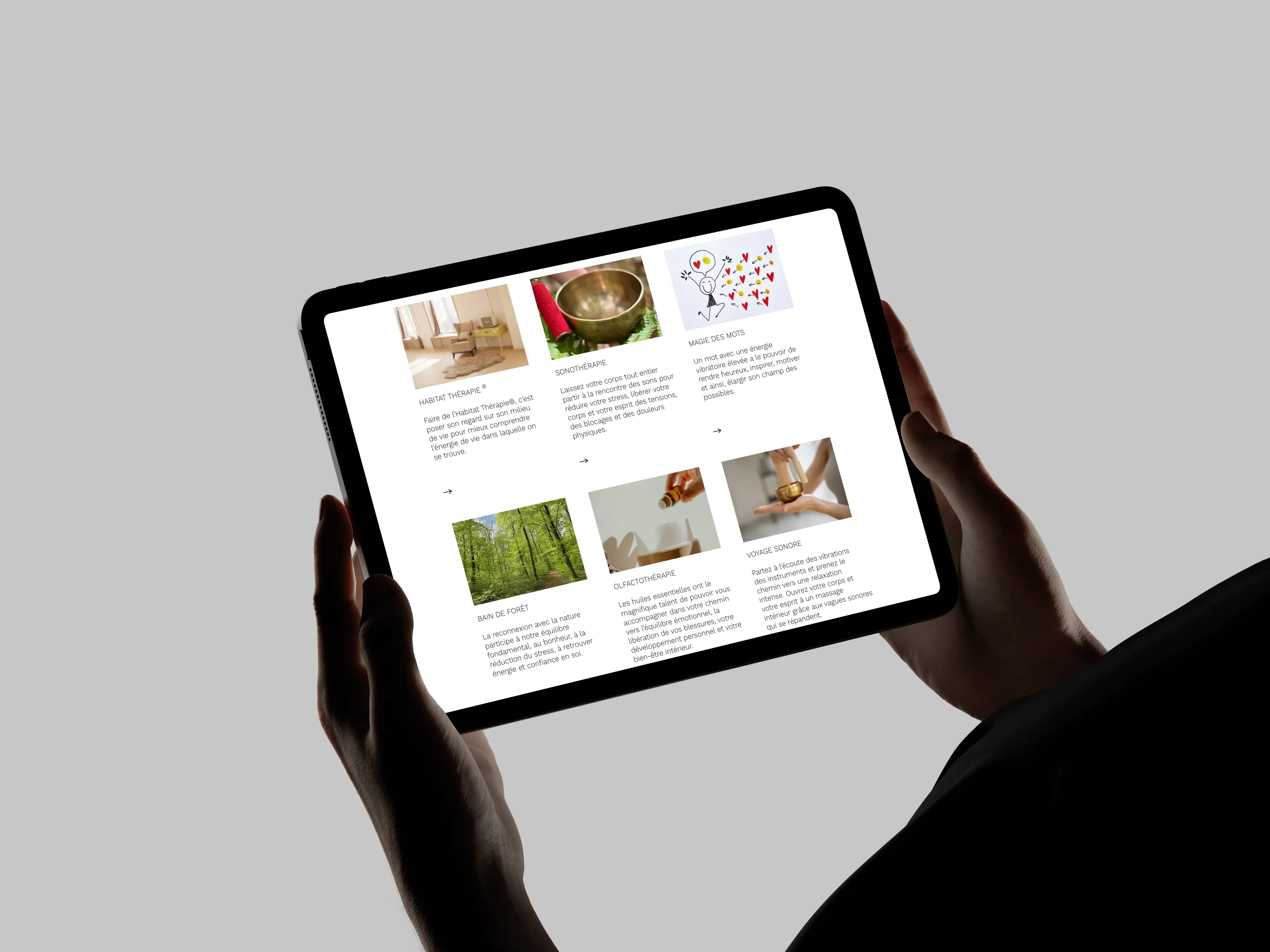
Context & Goals
During my internship at Fauves Agency, I worked on the new website for Martine Henderyckx, an independent wellness coach. The desktop design already existed, but the mobile version didn't — I was responsible for designing it from scratch in Adobe XD, then integrating both the desktop and mobile versions in WordPress/Elementor, all within a one-week deadline.
The project had three non-negotiables:
- Responsive behavior across devices, designed from zero on mobile, not just adapted from desktop.
- A CMS simple enough for a non-technical client to manage alone, with no developer needed for day-to-day content changes.
- Full consistency with the brand identity already established in the desktop design.
Role: UI/UX Designer (mobile) & Front-End Integrator (WordPress/Elementor)
Stack: Adobe XD, WordPress, Elementor, CSS
Problem & Design Challenges
The core challenge was straightforward but unforgiving: no mobile version existed — not even a rough concept, only the desktop design to work from as a reference. On a one-week deadline, I had to:
- Design a full mobile experience from scratch, learning Adobe XD in a live professional workflow.
- Implement both desktop and mobile versions in WordPress/Elementor with pixel-level responsiveness.
- Keep the CMS simple enough for a wellness coach with no tech background to update content independently.
The constraint that made it harder: the mobile design couldn't just be a scaled-down desktop. It needed its own content hierarchy — what a visitor needs to see first on a small screen is different from what works on a 27-inch monitor.
Concept & UX Approach
I defined three UX priorities for the mobile experience:
Content hierarchy first — On mobile, attention is scarce. I restructured the information so the most critical content (services, contact, booking) appeared immediately, with supporting content accessible but not competing for attention.
Brand consistency across viewports — Typography, colors, and tone had to feel like the same brand whether viewed on a phone or a desktop. I used the existing desktop design as my anchor and adjusted spacing, font sizes, and touch targets for mobile readability and interaction.
Clear CTAs and simple navigation — The mobile journey needed to be short and intuitive: land, understand, act. I designed minimal navigation and prominent call-to-action buttons to keep the user flow as direct as possible.
Architecture & Implementation
Design in Adobe XD
I started mobile-first in Adobe XD, designing each section as a component with clear boundaries. This made it easier to test spacing, test readability, and hand off clean layouts to the WordPress integration phase.
WordPress/Elementor Integration
I translated both the desktop and mobile designs into Elementor components, configuring responsive breakpoints to ensure clean transitions between mobile, tablet, and desktop. I set up plugins to support performance and content editing without overwhelming the client — the goal was a CMS she could own entirely.
Responsive Testing
I tested breakpoints across mobile, tablet, and desktop to refine transitions between them. The hardest part was ensuring images, text blocks, and CTAs scaled gracefully without breaking the visual rhythm established in the desktop design.
Development Workflow
The one-week deadline forced a tight, disciplined loop:
Day 1–2: Mobile design in Adobe XD, using the desktop design as reference. Focus on content hierarchy and section structure.
Day 3–4: WordPress/Elementor integration — translating XD mockups into live components, configuring responsive breakpoints.
Day 5: Plugin setup for performance and client-friendly content editing.
Day 6–7: Cross-device testing, bug fixes, final client validation.
Throughout the week, I checked in daily with the agency team and the client to validate decisions and adjust fast when feedback came in — there was no room for a slow feedback loop on a one-week timeline.
Key Decisions & Trade-offs
Mobile-first, not mobile-adapted: rather than designing desktop and shrinking it down, I designed the mobile experience from zero. It took more time upfront but ensured the mobile version felt intentional, not like an afterthought.
WordPress/Elementor over custom code: for a non-technical client who needs to manage content independently, WordPress with Elementor was the right call. It limited creative freedom compared to custom development, but it gave the client real autonomy.
Adobe XD as the design tool: I learned it on the fly during this internship. It wasn't my first choice, but it was the agency's standard. The constraint forced me to adapt quickly — a skill that matters more than tool familiarity.
One-week scope discipline: I had to say no to nice-to-haves. Animations, advanced interactions, and extra pages were cut in favor of shipping a responsive, consistent, client-ready site on time.
Challenges & What I Learned
Challenge: Learning Adobe XD in a live professional context
This wasn't a practice project — the client was waiting. I had to learn the tool fast enough to produce production-quality mobile mockups without slowing down the timeline. It taught me that tool proficiency matters less than design thinking: the principles of hierarchy, spacing, and consistency transfer across tools.
Challenge: Communicating with a non-technical client
A wellness coach doesn't care about breakpoints or CMS permissions — she cares about whether her site looks good on her phone and whether she can update it herself. I learned to translate technical decisions into client language and to validate design choices against her real-world needs, not just my technical assumptions.
Challenge: Balancing brand consistency with mobile constraints
The desktop design was the reference, but mobile demanded its own logic. Keeping the brand identity intact while restructuring content for a smaller screen was the most design-intensive part of the project.
Result: A fully responsive site that the client can manage independently, delivered on a one-week deadline with no scope cuts on responsiveness or brand consistency.
Current Status & Next Steps
The site is live at martinehenderyckx.be and has been running since 2024. The client updates content independently without developer support.
If I were to revisit this project today, I would:
- Push for a headless CMS approach to decouple content from presentation, making future redesigns easier.
- Add micro-interactions and scroll-based transitions to elevate the mobile experience beyond pure functionality.
- Improve accessibility: keyboard navigation, ARIA landmarks, and contrast ratios across all viewports.
Why This Project Matters
For recruiters and hiring managers, this project shows I can deliver under real professional constraints: a one-week deadline, a non-technical client, and a design tool I was learning on the job. It demonstrates that I can design AND implement — not just one or the other — and that I prioritize client autonomy by building CMS setups that don't require ongoing developer support.
For developers and tech leads, it shows I understand the trade-offs between custom development and CMS platforms, and that I can make pragmatic tool choices based on the project's actual needs rather than personal preference. It's a small project, but it taught me more about real-world delivery than any school assignment could.