Todana - Premium Furnitures E-commerce Website
Modern e-commerce website for a premium furniture brand, featuring a sleek design and intuitive user experience.
Website React NextJS TailwindCSS GSAP
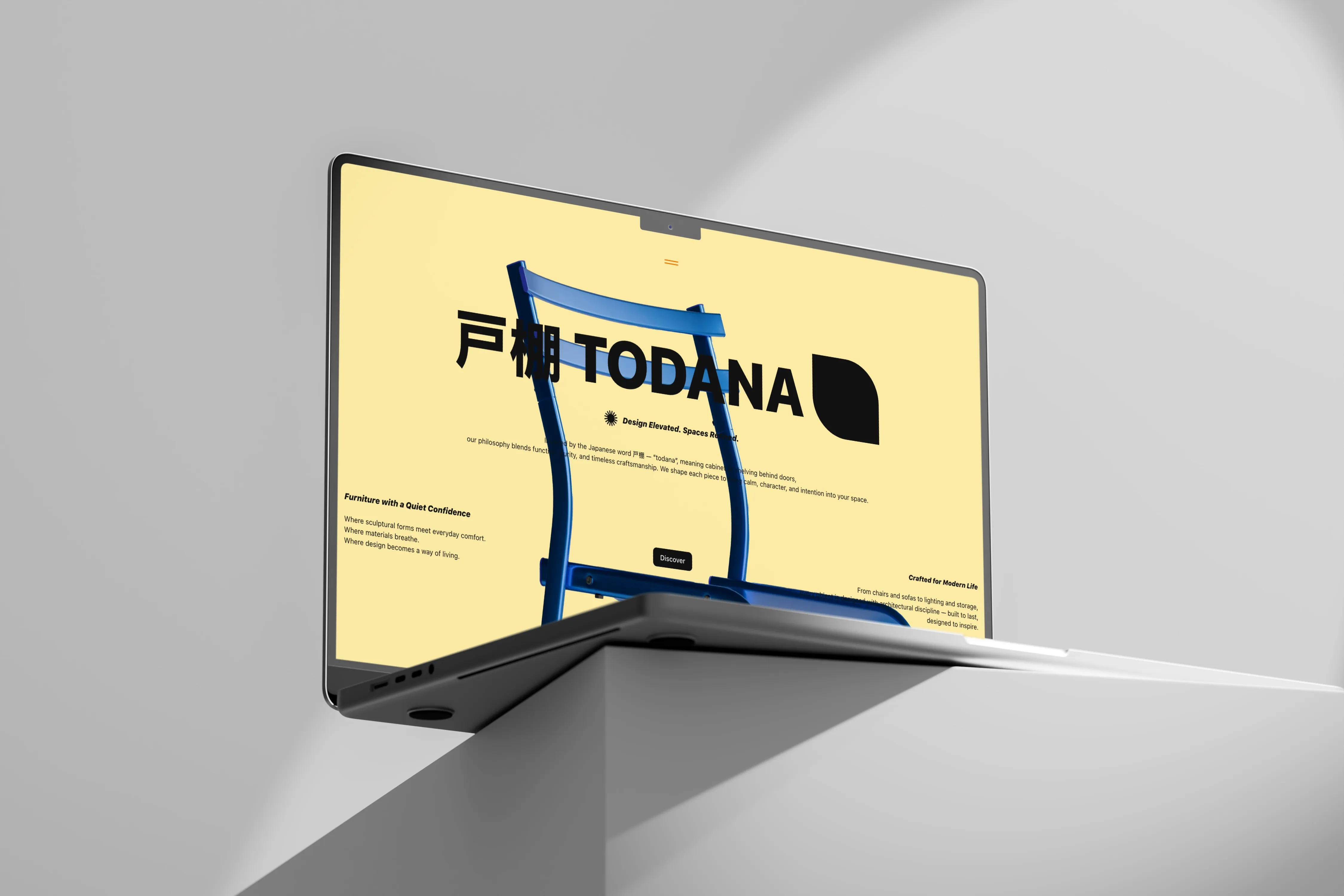
Context & Goals
Todana started as a collaborative class project. I designed the brand identity from scratch in Figma — name, logo, color system — and led the team through it: dispatching tasks, choosing the tech stack, and owning the GitHub repository. Since the group had very different levels of coding experience, I also built the base architecture myself, designed to be simple enough for everyone to build on without breaking the whole project.
I designed the Landing Page myself, both to contribute a page like everyone else and to set the implementation standard the rest of the project would follow. The teacher's brief included one unusual constraint: each member had to design and build their own page exactly how they wanted, with no shared design direction beyond the base I had set.
When the group project wrapped, I wasn't satisfied with the final result — with everyone designing independently, the pages didn't hold together as one coherent product. So I forked the concept and rebuilt Todana from scratch, solo, turning it into my own sandbox to:
- Fix the consistency problems from the group version with a proper design system and component architecture.
- Push into full-stack territory by switching from React to Next.js, an area I'm actively growing into.
- Practice motion design for the web with GSAP.
- Build a portfolio-ready project that speaks to both recruiters and developers.
My objective this time wasn't just "build a nice homepage" — it was to structure Todana like a product that could actually evolve into a small e-commerce experience: categories, product pages, interactions, and a scalable codebase, this time entirely under my own design and technical direction.
Role: Brand identity design & team lead (group phase) → Solo front-end developer & UI designer (rebuild phase)
Stack: React, TypeScript, Next.js, Tailwind CSS, shadcn/ui, GSAP, Bun, Vercel
Problem & Design Challenges
The group phase taught me a hard lesson about the limits of leading without full creative control: even with a solid shared architecture, a project without a shared design direction fragments visually the moment more than one person touches it. That became the problem I set out to solve in the rebuild:
"How would a modern furniture brand present its catalog online in a way that feels premium, fast, and trustworthy — as one coherent product, not a patchwork of individually-styled pages?"
From that question, a few constraints emerged:
- The UI needed to look polished enough for a real brand, not like a school exercise.
- The architecture had to be clean and typed, so adding real data or features later wouldn't require a full rewrite.
- Motion should feel intentional: no noisy animations, but transitions that guide attention and support the UX.
- Every page needed to follow the same design system — the exact discipline the group version lacked.
Concept & UX Approach
I defined three key UX pillars:
Clear visual hierarchy — Hero section, featured collections, and product highlights needed to be instantly understandable, even on a quick scroll.
Calm, cinematic motion — I used GSAP not for "flashy effects," but to soften transitions between sections, introduce staggered entrances on product cards, and create a subtle feeling of depth and continuity when navigating.
Consistency over complexity — Rather than building ten different page types, I focused on a strong homepage/hero, a catalog/grid that reuses the same design tokens, and a product detail layout that can be cloned and extended later. This time, one set of decisions — mine — carried through every page.
Architecture & Implementation
Design System & Components
I relied on shadcn/ui as a base for accessible, well-structured components, then extended them with my own design system using Tailwind: buttons, navigation elements, cards, and typography follow shared tokens (spacing, colors, radii), while domain-specific components — product cards, collection sections — compose these primitives into Todana-specific UI patterns. This separation makes it easy to swap visual themes without rewriting logic, and reuse base components across new sections (team, testimonials, future "story" pages).
Type-Safe Front-End
Using React + TypeScript, I defined interfaces for product data (names, prices, tags, images, descriptions), collections and categories, and layout props (titles, CTAs, alignment). This gives two immediate benefits: safer refactors, since changing a data model instantly surfaces where I need to update UIs, and developer clarity, since anyone reading the code quickly understands what each component expects and returns.
Motion & Interactions
For motion, I integrated GSAP carefully: staggered reveals on product grids, scroll-linked animations for hero and section transitions, and micro-interactions on hover states to reinforce the premium feeling. The goal wasn't maximal animation density, but controlled rhythm — enough movement to feel alive, never enough to feel exhausting.
Development Workflow
I optimized my personal workflow so Todana feels like a small production project: Next.js for a fast dev experience, Bun as package manager and runtime for speed and simplicity, Vercel for frictionless deployment and preview environments.
Typical loop: sketch/prototype layout ideas in code directly using Tailwind, add basic GSAP hooks once the layout feels right, refine TypeScript types and component boundaries as patterns emerge, deploy to Vercel, test on multiple devices, adjust breakpoints and performance.
Key Decisions & Trade-offs
Rebuilding instead of patching: rather than trying to fix the group version page by page, I chose to fork and rebuild from scratch — a bigger investment, but the only way to guarantee real consistency.
React to Next.js: I switched frameworks specifically to push myself toward full-stack territory, an area I'm still building depth in, rather than staying safely within what I already knew from the group version.
Desktop-first, then responsive: as Todana is a visual furniture experience, I started with desktop to lock in composition and storytelling, then adapted the layout to smaller viewports.
Mock data first, real data later: I modeled the UI against static, typed mock product data, keeping the architecture ready for a real API or CMS without over-engineering the first version.
Less pages, more depth: instead of shipping many shallow pages, I focused on a few core views (hero, catalog, product details) and made them feel as rich as possible.
Challenges & What I Learned
Challenge: Leading a team without full creative control
The group phase taught me that shared architecture alone isn't enough to keep a product feeling coherent — without a shared design language, individual freedom fragments the result. It's a lesson about leadership as much as design: next time, I'd negotiate a shared design foundation up front, even within constraints set by someone else.
Challenge: Balancing motion and performance
Adding GSAP to a visually dense page can quickly hurt performance. I had to limit the number of animated elements on initial load, reuse timelines and avoid unnecessary re-renders, and think carefully about when to animate (on scroll, on hover, on mount).
Challenge: Structuring a "fake" e-commerce like a real one
Even without a real backend, I treated Todana like a product: defined domain models (Product, Collection), thought in terms of "features" instead of "pages," and organized the repo so another developer could join and quickly understand the intent.
Result: Todana evolved from a fragmented group project into something that feels like the skeleton of a viable front-end for a future furniture brand — and taught me as much about leading a team as it did about code.
Current Status & Next Steps
Today, Todana includes a hero experience introducing the brand and core collection, a catalog-style grid with animated cards and a shared UI language, and an evolving product detail layout that can later support deeper content. This is a work in progress, but already polished enough to share.
Planned evolutions:
- Integrate a typed data layer (JSON or headless CMS) instead of hardcoded mocks.
- Add filters and category navigation to make the catalog more useful.
- Refine accessibility (keyboard navigation, landmarks, ARIA roles).
- Experiment with a fake cart & checkout flow to tell a full e-commerce story in the case study.
Why This Project Matters
For recruiters and hiring managers, Todana shows I can take a project from brand identity through team leadership to solo technical execution — and that I recognize when a result isn't good enough and take the initiative to fix it on my own time. It shows I care about how a digital product feels as much as how it works, and that I'm comfortable communicating design and technical decisions clearly, whether to a team or in writing.
For developers and tech leads, it demonstrates familiarity with modern front-end tooling (React, TypeScript, Next.js, Tailwind, shadcn/ui, GSAP, Bun, Vercel), attention to architecture, typing, and scalability, and a mindset oriented toward ownership and maintainability, not just one-off prototypes.
If you'd like to dive deeper into the code or the reasoning behind specific parts of Todana — architecture, motion decisions, or design system — this repository is meant to be read, critiqued, and extended, exactly like a real project in a team environment.